The home page is a standard section of every website, whether it is an extensive online store, an online portfolio or an elegant restaurant. As the name implies, this page condenses relevant information about the brand and in many cases serves as a starting point for visitors to learn more about the company, staff, vision and mission, services and products offered, among others.
Of course, visitors may arrive directly at another page that is part of the website as they perform a more direct search on search engines. However, a percentage of the visitors will visit the homepage first.
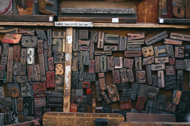
Certain elements are considered essential in every home page, although they may vary slightly depending on the business heading and the purpose of the website itself. But in this article, we will not give you general advice about design, but about the use of typography.
In every web page, typography is of great importance since it is an element that allows the message to be communicated textually and visually at the same time. For this reason, there are certain factors to consider when working with fonts on your home page.
Consider the communication tone of the brand
Although it is important to consider the readability, spacing, and visibility of your typography on different devices, it is also essential that you consider other aspects of the selected font. These characteristics are related to the personality of the typography and if it aligns with the brand. Remember that there are sources that have great expressiveness and have the power to reinforce your message or simply confuse your users when there is no relationship between the text to be communicated and the selected source.
Consider the tone of the communication, the personality of the brand and the message you want to convey when selecting your typefaces. If you also consider these factors, the selection process will be much stricter and you should probably eliminate some previously chosen sources that may be quite readable, but do not align with the three previously mentioned components of your website.
Use blank spaces wisely
Blank space is an essential component in every design and has several benefits. Among the most important we have the readability optimization and the possibility of a correct visual reading of the elements that make up the design or website, in this case.
Use blank spaces appropriately when locating and aligning your typography. You may have a lot to say to your visitors and future customers, but this condition is not a reason to place a large amount of text on the home page. It will have the opposite effect as the user will feel confused.
Remember that users are not accustomed to reading long paragraphs of text on the web and could be the cause of the rapid abandonment of your website by verifying that the percentage of the text seems higher than other content. Additionally, by not applying adequate spacing to your text blocks, you can compromise their readability. So learn to work with blank spaces and use them wisely in your home pages.
Use your sources consistently
Although your website is likely to consist of several pages and each of them has a certain type of featured content, all these pages are part of a single website and therefore should be felt like part of the same group. This sense of unity can be called coherence and is a term that you will often hear if you dedicate yourself to developing web projects.
One of the ways to maintain consistency is through typography. Choosing the number of sources and score allows you to increase the coherence of the web design, but it is not the only element that is taken into account, you should also consider the color palette, the style of the images, etc.
It is recommended that you create a style guide for the sources on the website, distinguishing between the title, subtitles, body of text, quotes and any other type of text that is necessary. Although it is possible to have 7 different types of text elements, it does not imply that you should use 7 different fonts.
The most common is to choose only 2 or 3 fonts in different versions. For example, both for titles and body text you could use the same font, but for titles, it would be more appropriate in “Bold” or “Black” version, while for text body, you would use it in “Thin”, “Medium” or even “Regular.” The score in both cases differs greatly because the title must be much more visible than the body text.
Check all areas of your home page, from the menu bar to the footer and verify that the use of the sources is consistent.
Consider your display on mobile devices
You cannot deny the importance of mobile devices today. A considerable percentage of traffic likely comes from such devices. All that remains is to adapt as mobile devices have several features that you should consider when designing. One of the most outstanding: the screen size.
Although the size and resolution of mobile device screens have improved over the years, it cannot be compared to the dimensions of computers and laptops. You must get used to working with fonts on smaller screens. Although there are guidelines for the proper use of mobile fonts, the best thing you can do in these cases is to perform tests.
Consider the font size, kerning and tracking, line spacing and the number of words per line of text to ensure that the typography has been used effectively on your homepage and is readable on mobile devices.